
3 Web Design Trends from November 2022
Colour and depth were the main themes in this November 2022 review of website design trends. The colour Red was a prominent choice, appearing widely in backgrounds. Three-dimensional elements and depth of field also made a strong impression.
Here are the design trends featured that month.
1. Red Backgrounds
Red suggests power, passion and attention, but had not always been a common choice for web designbackgrounds. These examples put red in the background with a bold, bright visual approach.
And it works.
In the projects below, red helps communicate the design message and draws viewers towards the content. For Pentel, it is also part of the brand palette.
Arze uses a strong red background with smaller contrasting areas to showcase items. The colour continues through scrolling, creating a bold appearance while giving products contrast and visibility.

Russia–Ukraine War uses red’s emotionally charged character to support content explaining the conflict.

Pentel uses a slightly softer red background. Here, red is a brand colour that helps draw attention to the website’s products and elements, continuing through the page to sustain the theme.

2. 3D Icons and Graphics
Three-dimensional elements featured in many web design projects, including work produced by our own team.
3D icons, graphics and illustrations can be challenging to create and use well. Their playful character does not suit every type of content, which can limit where they are appropriate.
Each project takes a different approach:
Admilk uses a series of 3D animations featuring its brand name. The playful, unexpected graphics include balloon-like objects, milk, cereal and grass with flowers.


Refokus uses three-dimensional objects that move on scroll to create direction and visual interest in an otherwise restrained visual space. They follow the page’s aesthetic and guide visitors through the design without overwhelming them.

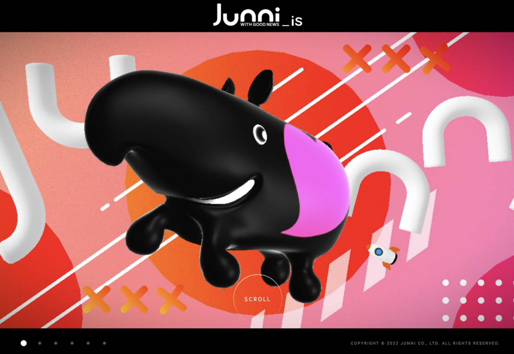
Junni shows a website design well suited to 3D. Its illustrated bubble graphics resemble a playful style also seen in icons and emoji, with animation reinforcing the light, childlike character.

3. Extended Depth of Field
Photography and video with extended depth of field appeared across travel, architecture and eCommerce projects in this review.
A deep depth of field keeps much of a scene acceptably sharp. In photography, depth of field is the distance between the nearest and farthest objects that appear sufficiently in focus.
Each example uses strong imagery with visible depth, whether still or moving, to draw people into the design.
The appeal is being able to see a wider scene and feel part of it. This visual concept can serve many purposes.
Design Arredamento uses photographs with a broad area in focus to provide interior design inspiration. Clear lines make it easy to engage with the image and imagine the room. Scroll-based zoom draws viewers further in, while depth helps preserve context and a sense of the objects farther away.

Interest Media uses a video sequence that gradually zooms out. The imagery remains clear beneath a readable text overlay, creating a feeling of moving backwards along the bridge in the video.

Conclusion
Two themes overlap throughout these examples: prominent red colour and visual depth through photography and three-dimensional graphics.